
Sharpe ratio converter
When we run our backtests in NT8’s Strategy Analyzer, NT8 returns the Sharpe Ratio. (An extremely flawed but still widely used metric, named after William Sharpe.) It should be noted that NT8 gives this metric based on the monthly profit.
This may be confusing at first, because most professional trading houses use, for better or worse, the Annualized Sharpe Ratio in their work. In fact, many professional traders look for an Annualized Sharpe Ratio of 1.5 or better in their algorithmic trading strategies, with 1.0 being the bare minimum.
To be able to decide if the Monthly Sharpe Ratio we are presented with in NT8’s Strategy Analyzer would meet requirements in a professional setting, we have created a Sharpe Ratio Converter. The simple calculation converts the NT8’s Monthly Sharpe Ratio into the generally accepted Annualized Sharpe Ratio.
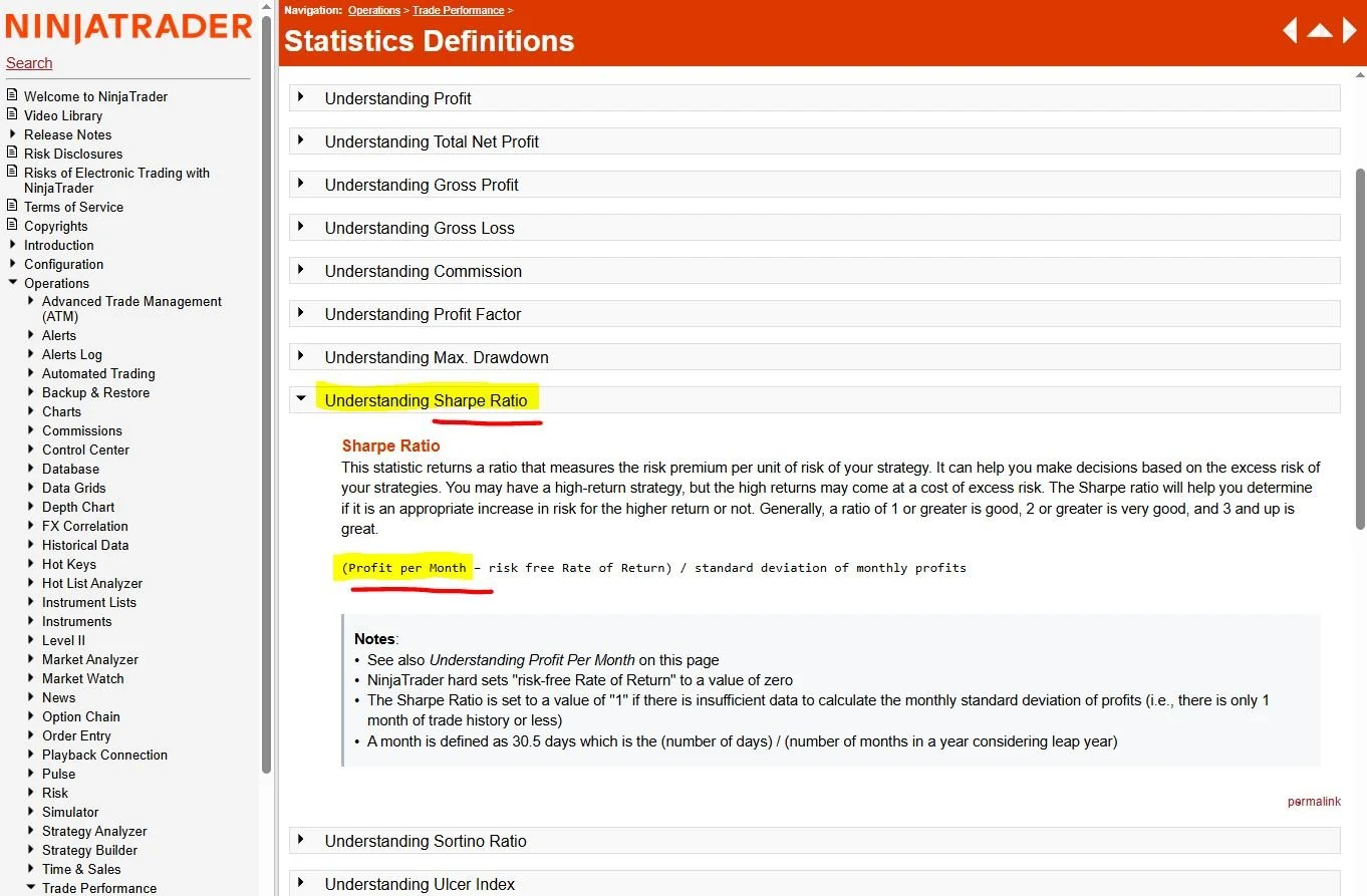
Understanding the Sharpe Ratio (NT8 User Guide)
Use the converter below to find out if the Monthly Sharpe Ratio you get in NT8’s Strategy Analyzer would make a hedge fund manager happy. For the full picture, we have also included the third Sharpe Ratio metrics, the Daily Sharpe Ratio in the below calculation as well.
Before we move on, it’s important to emphasize: trading strategies with a less than 1.0 Sharpe Ratio can be profitable. The Sharpe Ratio is not a measure of profitability, it’s a measure of the smoothness of the equity curve at a given risk level.
Enter the “Sharpe ratio” value from your NT8 (see below) into the yellow field to calculate the Annualized and the Daily Sharpe Ratios.
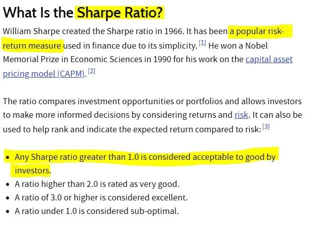
The Sharpe Ratio (source: Investopedia)
The significance of the Sharpe Ratio
The Sharpe Ratio quantifies a very important aspect of trading: what level of risk do we have to carry in order to achieve a given return? Obviously, we would like to maximize our return while minimizing our risk. To put it simply: do we want a potentially higher return and a wilder ride, or are we happy with a lower return but with a smoother ride.
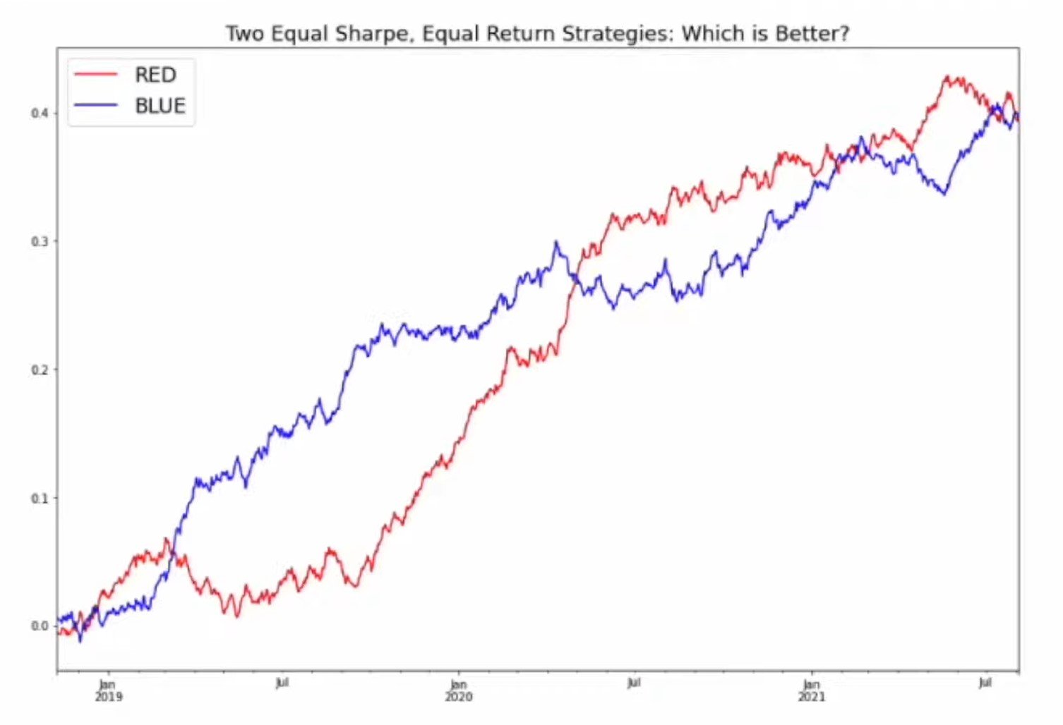
See the two equity curves (blue and red) on the right: same return over the same period. But which one is “better”?
Now let’s look at our equity curves below: same settings, same period, one is NQ, the other the RTY. But which one is better?
Notes to the above equity curves
While most traders would see with the naked eye that the NQ equity curve on the left is “better”, deciding which equity curve is “better” is not always easy. It’s best to quantify things. A good way, and an accepted way in finance to quantify which equity curve gives us a better risk/reward mix, is by calculating the (Annualized) Sharpe Ratio.
In the above backtests, NQ’s Monthly Sharpe Ratio was 0.37, which equals an Annualized Sharpe Ratio of 1.37, while RTY’s Monthly Sharpe Ratio in the same test was 0.22, which equals an Annualized Sharpe Ratio of 0.762. (So the numbers confirm what we see: NQ’s curve is smoother.)
It is important to note that both strategies were profitable in the above backtests. The difference is, and what the Sharpe Ratio measures, is not the profitability per se, but the smoothness of the equity curve.
As a third example, see GC’s backtest for the same period. GC has produced exorbitant returns lately, and it and silver were our most profitable instruments in 2025, but what a wild ride it was with an Annualized Sharpe Ratio of a mere 0.520!
Long story short, in our trading it’s important to carefully consider what risk we are ready to carry to achieve a given return. Yes, we can turn up the dial, but that goes together with higher risk as well. No free lunch, remember?